Branding, UX/UI design, and website development for a premium furniture manufacturer.
Client
Based in Belgrade, Tekstura Buro creates premium custom-made furniture in collaboration with leading architectural and design studios.
Challenge
Branding & Identity
The website needed to convey the brand’s premium feel and commitment to quality, supporting the company’s expansion into new markets. Another goal was to create a flexible brand identity that could be easily scaled across different channels.
Universal Touchpoint
The website had to become a universal touchpoint — the main point of contact between new clients and the brand. Since the workshop is closed to regular visitors, the site is the only way for potential clients to understand the company’s workflow and values during their first interaction.
Positioning Issues
The redesign was driven by the company reaching a new stage of growth. It was therefore essential not only to create a new brand identity and website but also to reflect the shift in scale and values — from a small craft studio to a boutique design bureau.
Solution
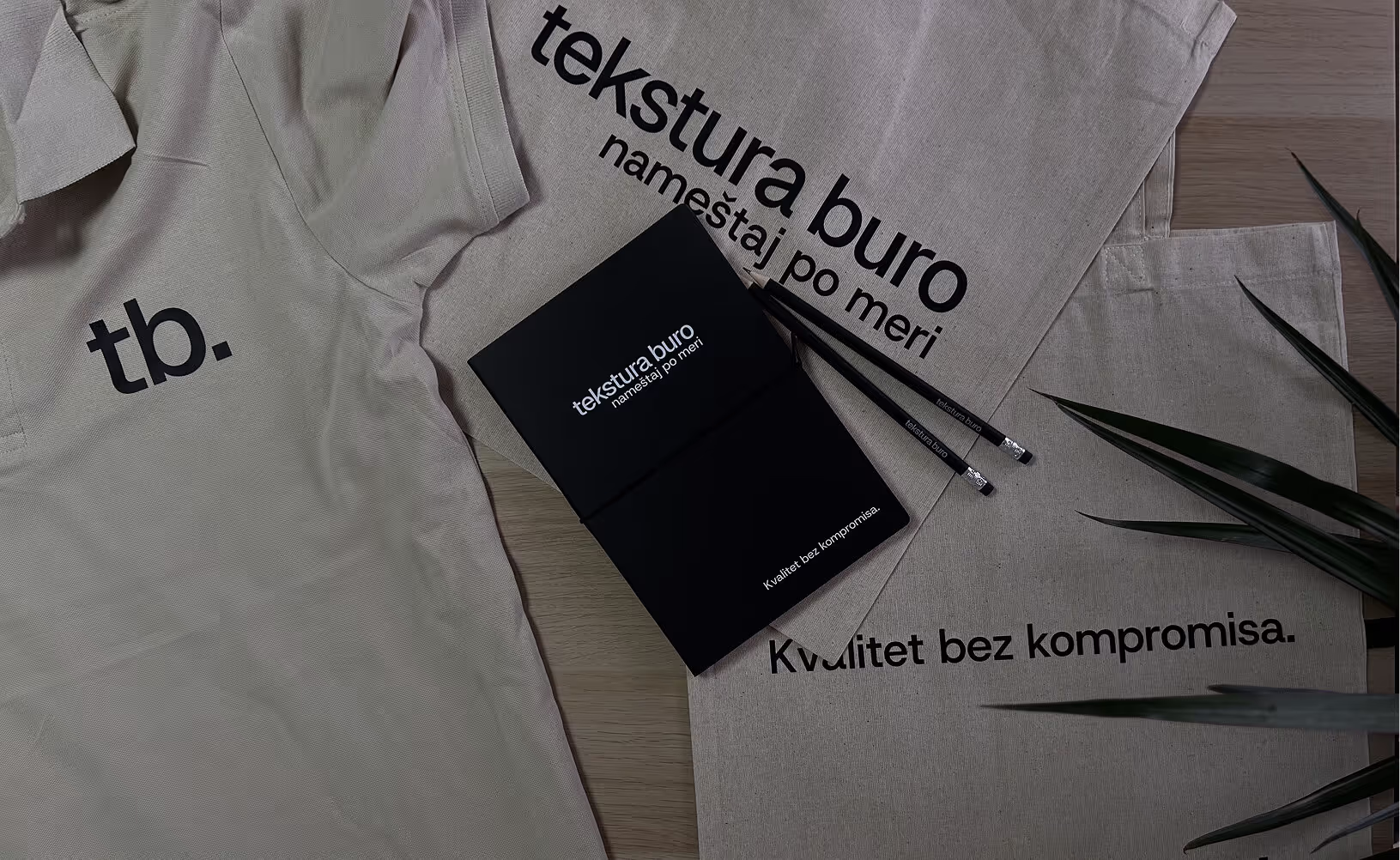
I conducted several co-design sessions with the brand’s founder and marketing manager. During the process, I proposed several design concepts that included both the website and brand assets. After the concept was approved, I developed the website, brochure, and visual identity, which was later used for creating branded merchandise.
Impact
7000+
website visitors over the year
40+
inquiries received through the site in 6 months
Inspiration
I started by looking at competitors' websites, but soon expanded my search to architectural books, magazines, and brochures. Along the way, I came across Technical Aesthetics, a Soviet-era magazine that became a key source of inspiration.
Although it focused on technical and engineering topics, its layout — influenced by avant-garde movements like the Bauhaus — struck a perfect balance between simplicity and functionality. This style felt like a natural fit for the Tekstura Buro website, conveying a sense of quality, confidence, and expertise.
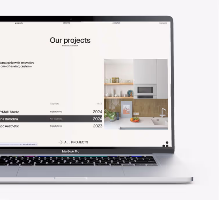
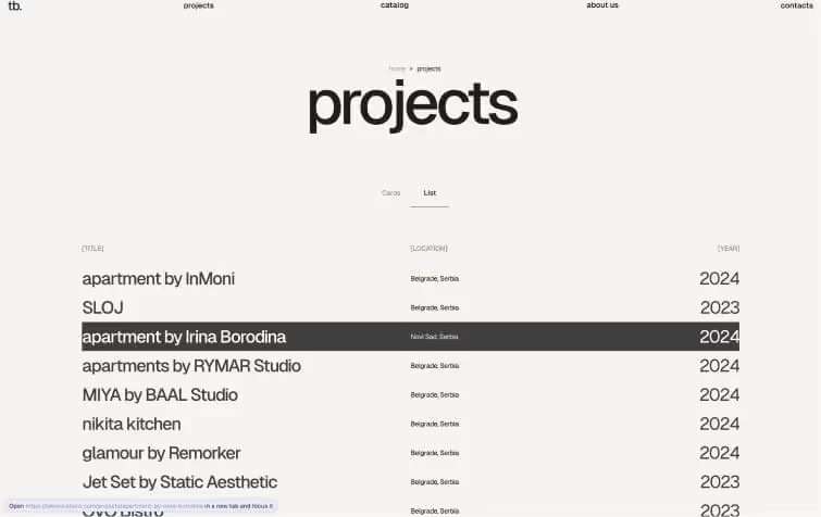
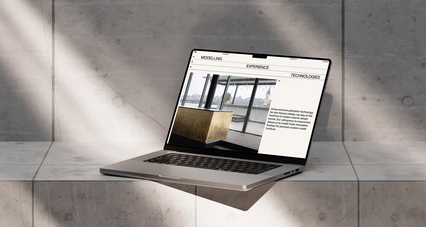
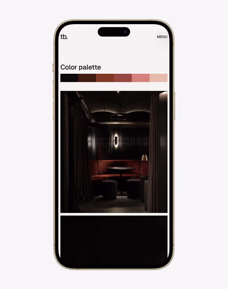
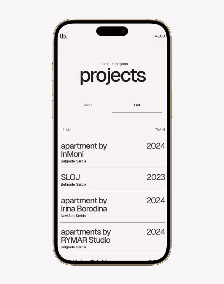
Website
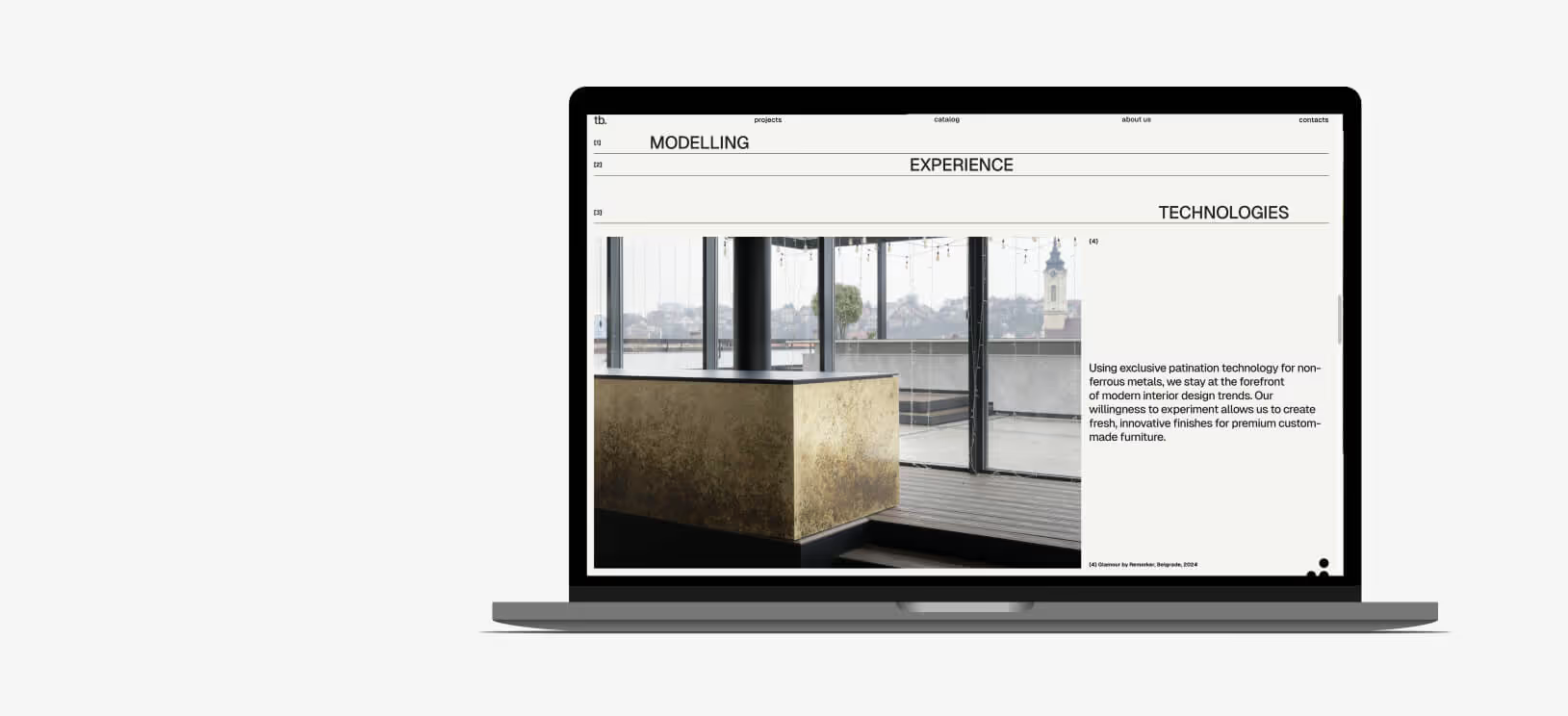
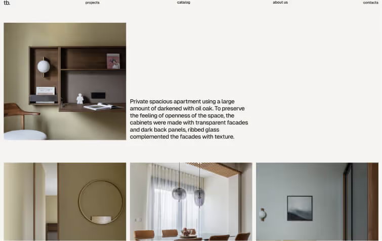
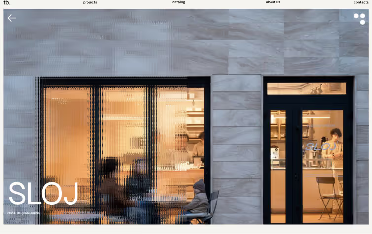
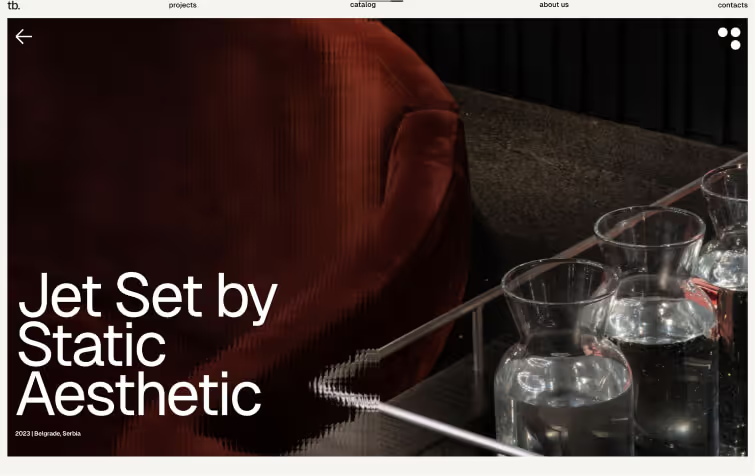
When creating the site, it was essential to focus the user's attention entirely on the product photos. The design needed to complement the perception rather than compete with the content.
In the site design I used graphic metaphors to reveal brand identity. For example, .psd template with a glass texture was created for the footer and project covers. It improved text legibility and graphically referenced the brand name.

Branding
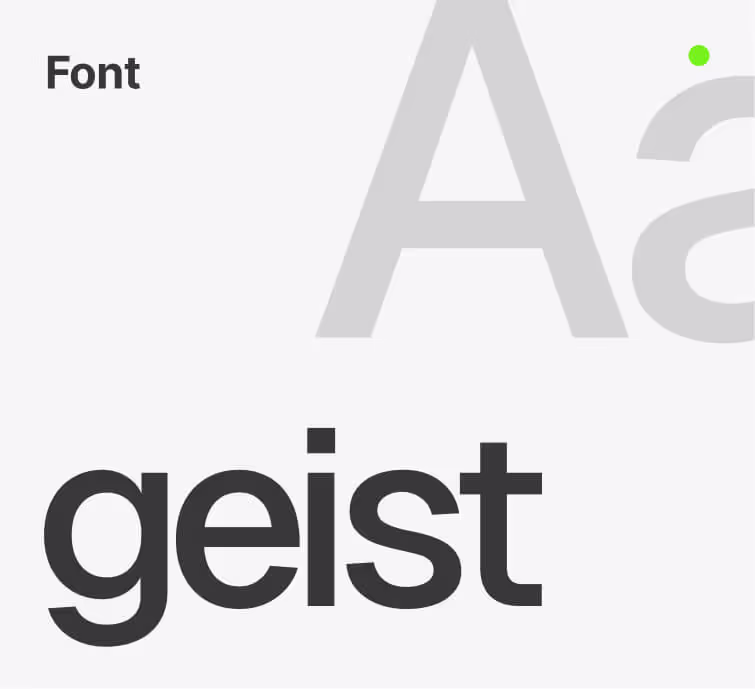
The logo and brand constant is the company's name, written in Geist font with lowercase letters and -3% kerning. This provides flexibility, allowing the identity to be freely used across various touchpoints, from social networks to notebooks and merchandise.