UX redesign & website development for a tea shop and teahouse.
Client
Tea Guy (Chayny Chel) is an independent space in Belgrade dedicated to tea culture, combining retail with educational workshops and authentic tea ceremonies for locals and visitors alike.
Challenge
Low ad conversion
Although contextual ads drove traffic to the website, visitors often left without completing a purchase.
Complicated interface
For customers unfamiliar with tea culture, navigating the catalog and categories was confusing and unintuitive.
Lack of a unified style
The website looked outdated and template-based. UI inconsistencies — such as mismatched elements and the absence of a cohesive color palette — weakened the brand’s identity.
Solution
After analyzing user pain points and conducting UX research, I redesigned the website—updated the structure, catalog, checkout flow, and overall visual style. The redesign increased conversion from 3.93% to 6.4% and established a cohesive style applied across social media and merchandise.
Impact
↑63%
average conversion rate (3.93% → 6.4%)
5500+
sessions over 6 months
100+
positive reviews from users
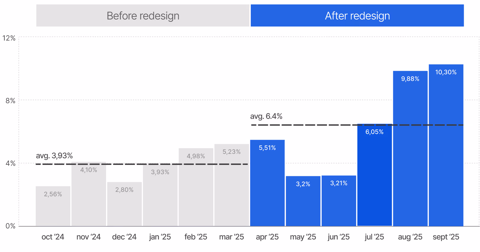
Monthly purchase conversion rate
Design process
Before the redesign, I conducted interviews with the founder and regular customers to understand their needs and challenges. I identified and mapped key pain points, using them as a foundation for the new design—addressing both visual inconsistencies and navigation issues.
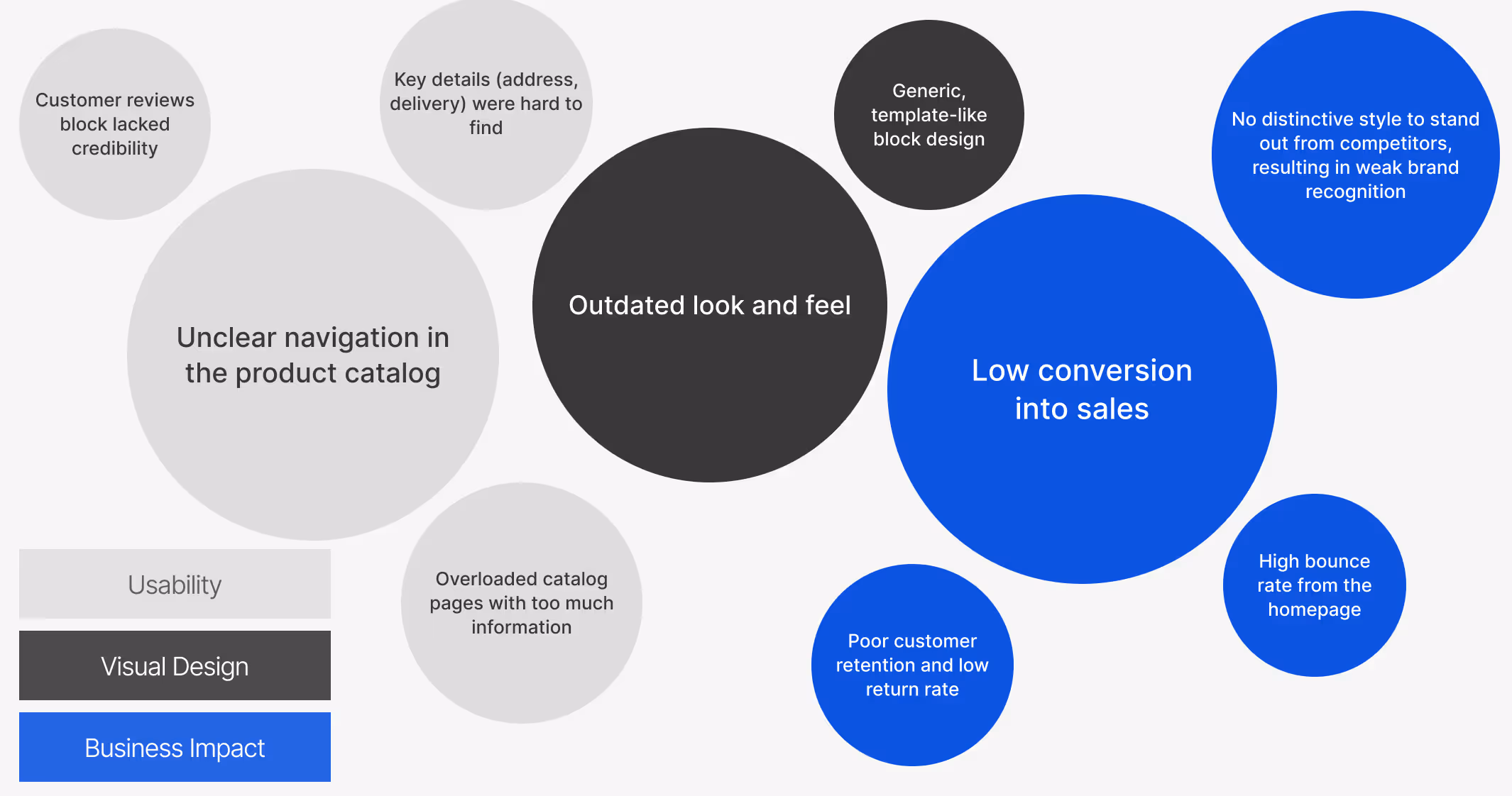
Problem mapping
I then created user flow structure to map touchpoints and clarify how the website integrates into the customer's journey with the brand.
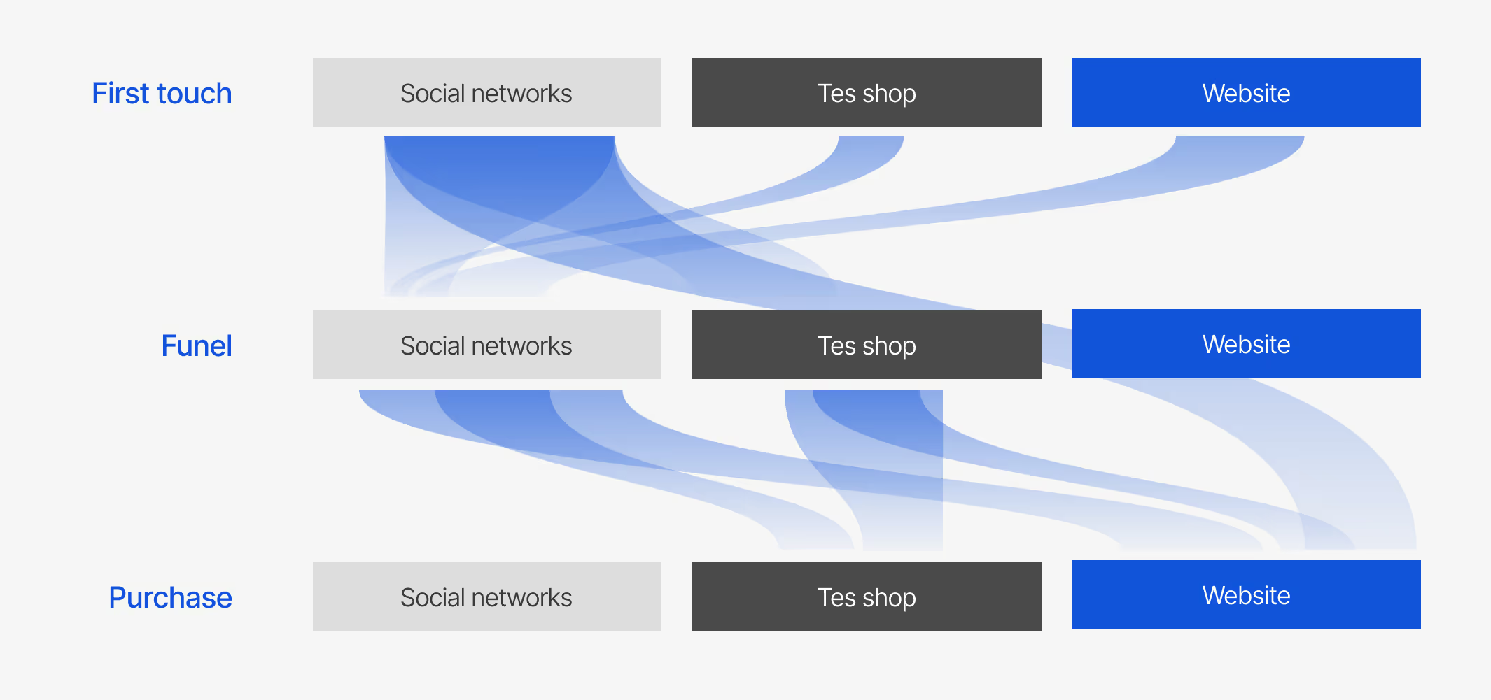
User flow structure
Using this map—informed by conversion data and interviews with the founders and customers—I identified the website's role in the user journey: it's not typically a discovery channel, but rather a key purchase point for loyal customers.
Website redesign
This section highlights the key design and interface improvements I implemented.
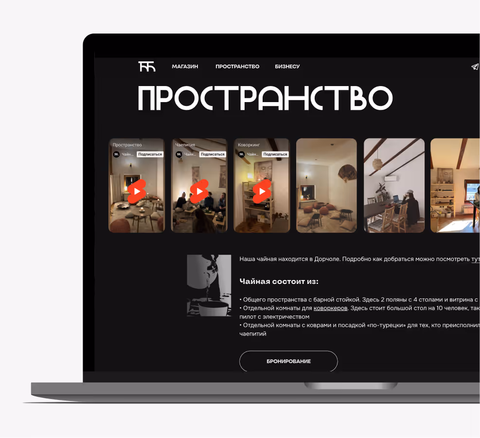
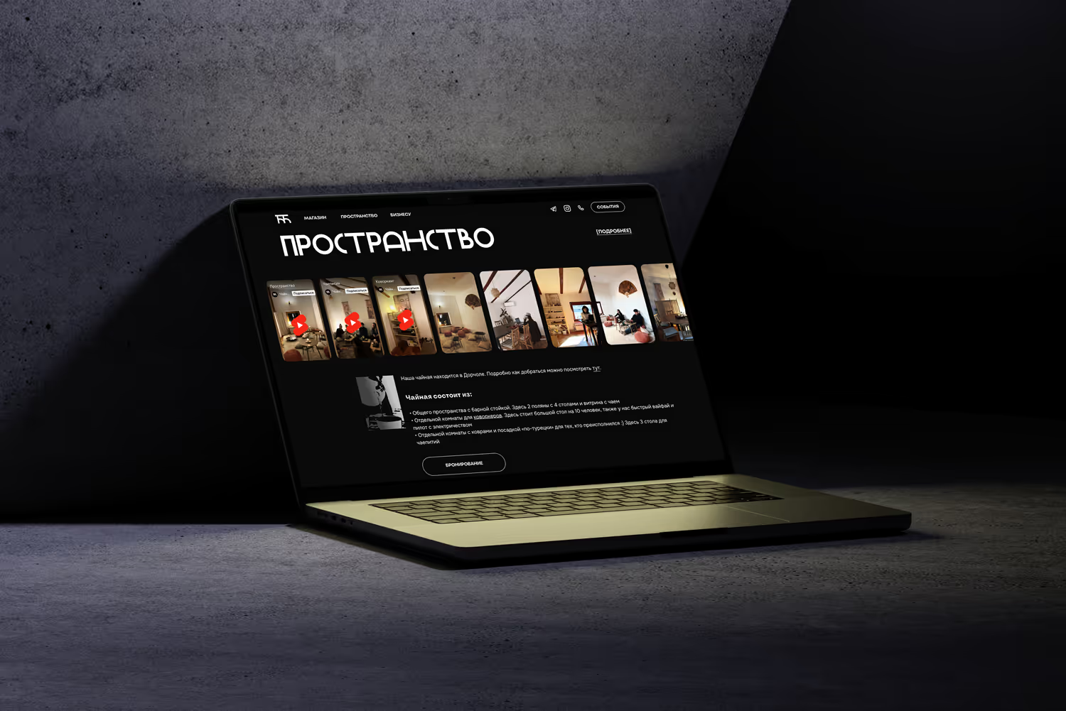
Main page
Before redesign
After redesign
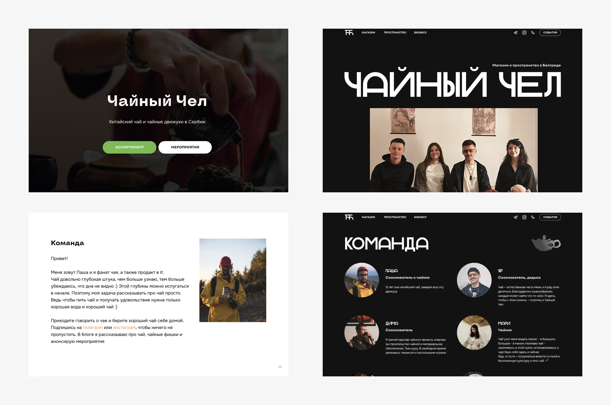
I redesigned the homepage to showcase the physical space and team, added intuitive category navigation to improve shop accessibility, and expanded the 'Team' section to strengthen brand connection.
Catalog page
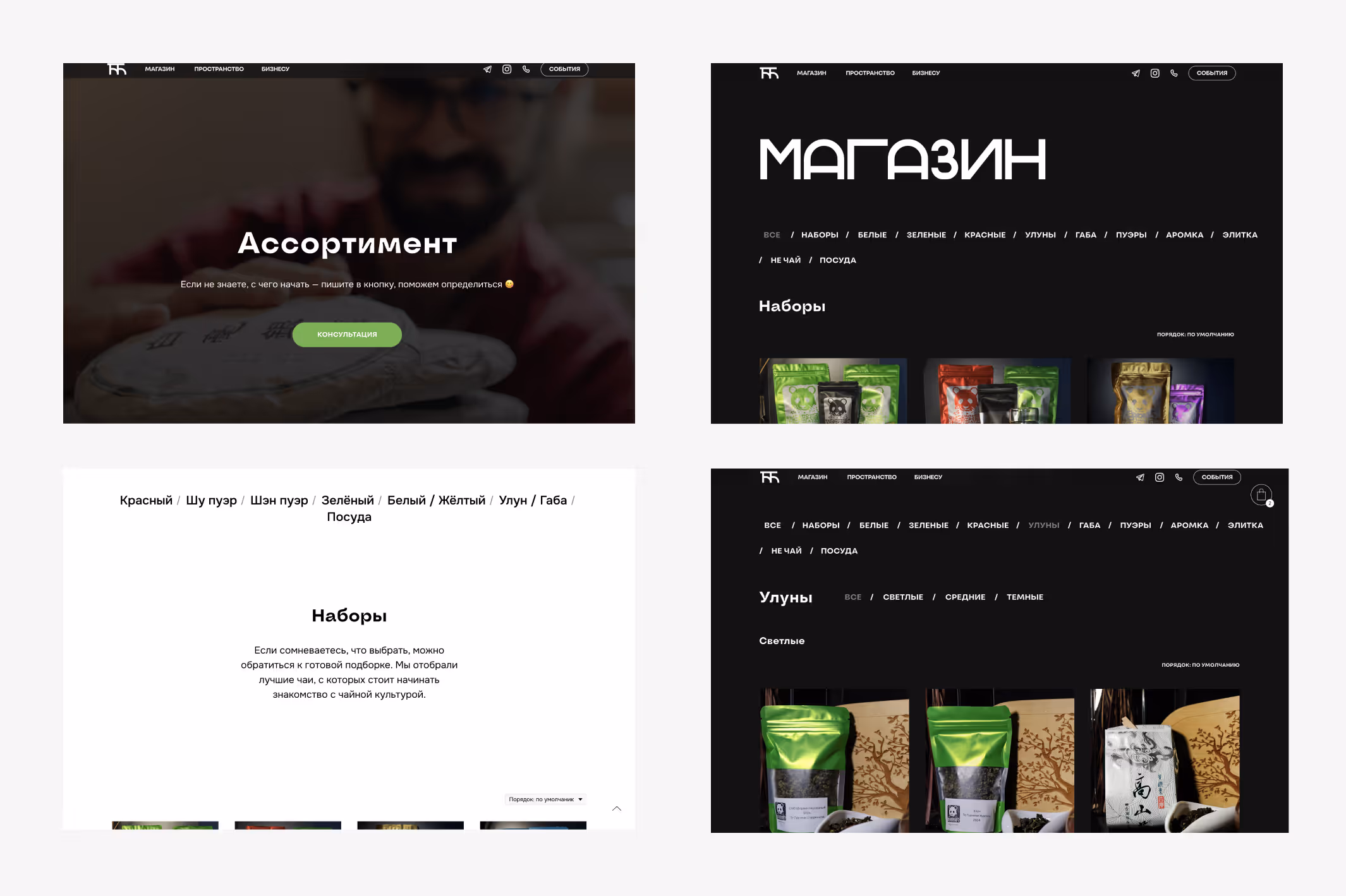
The shop redesign features a compact header, intuitive filters, and two-level navigation—reducing the path to purchase and improving product discoverability.
Unnecessary buttons and visual clutter were removed from the product grid — now purchases are made directly from the product page. Since this type of tea is rarely bought in large quantities, the decision proved to be well justified.
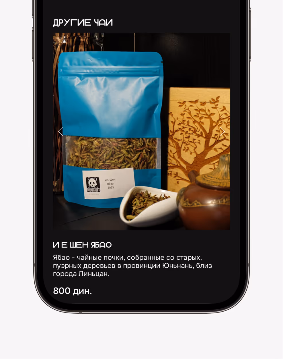
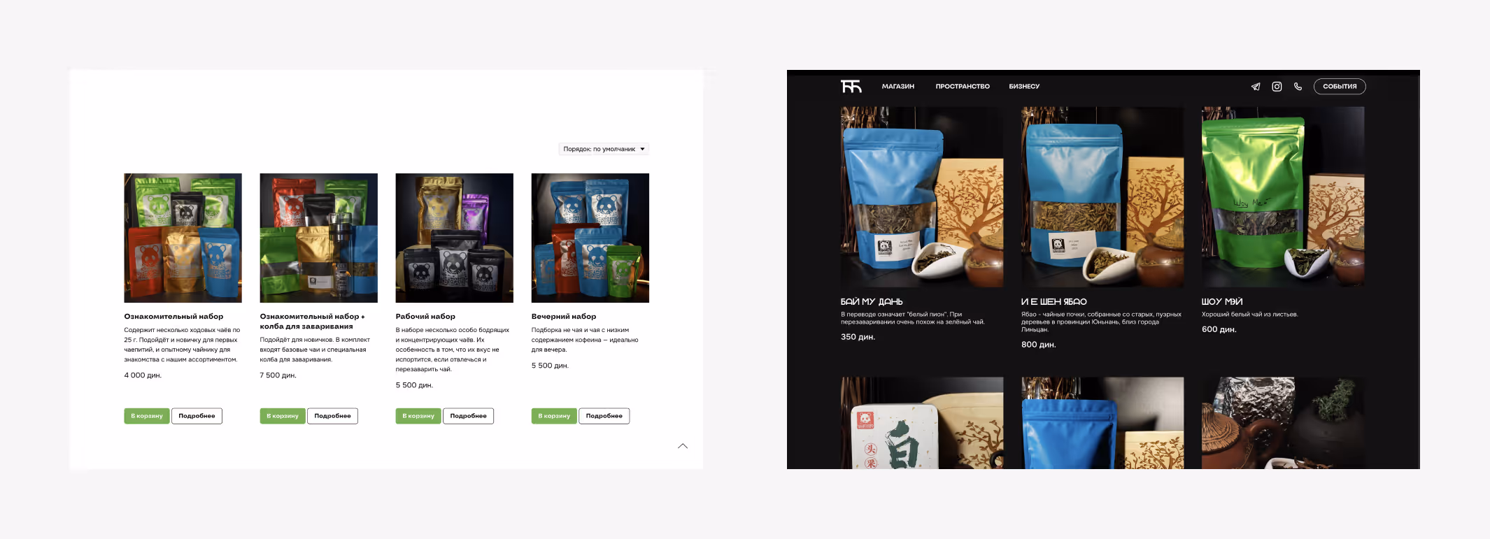
Product page
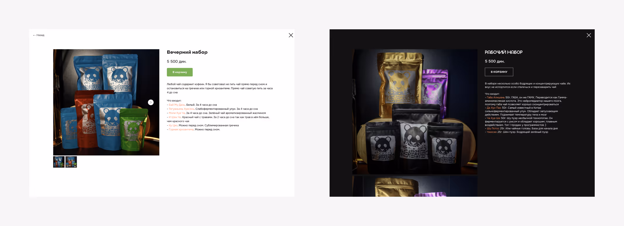
On the product page, images became larger and the design more consistent.
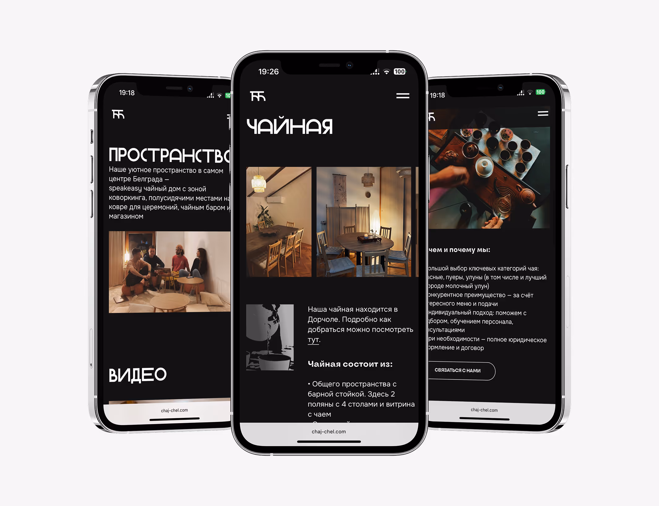
Service pages
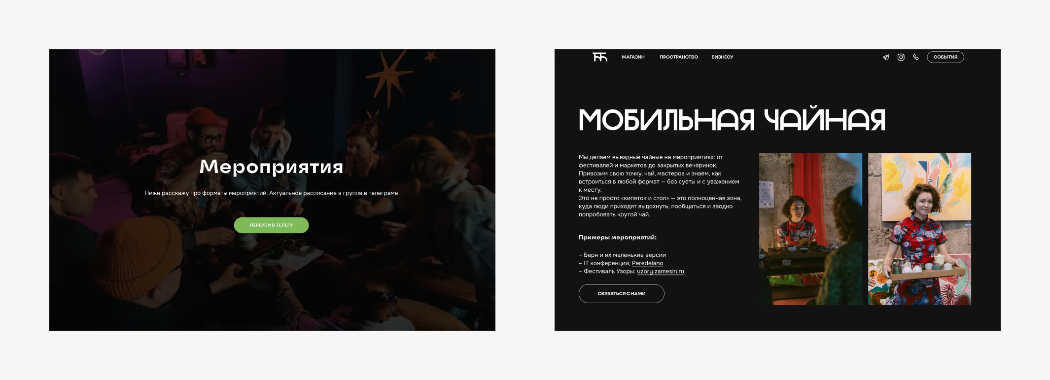
The layout of the service pages was redesigned to be simpler and more informative. Since these pages are mainly targeted at the B2B segment, the focus was placed on making the information clear and easy to understand.
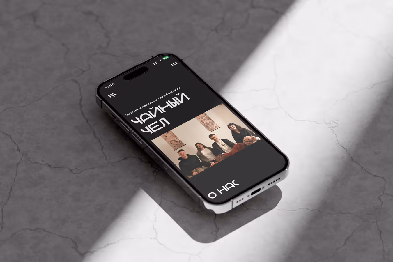
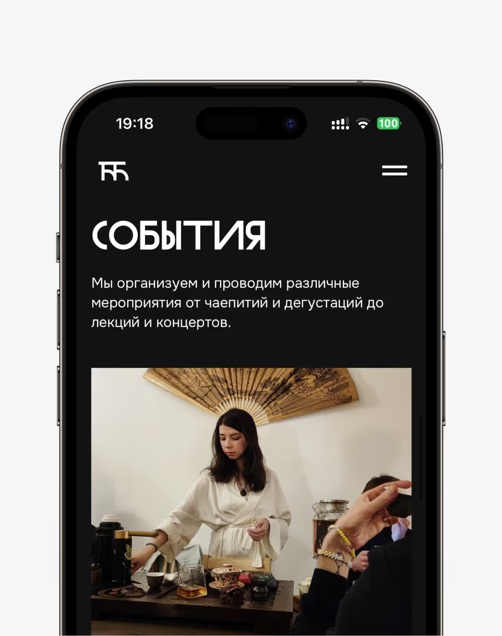
New website
When creating the website, I aimed to convey the atmosphere of the space itself and its tea ceremonies. That’s why I chose a dark background and selected Gerhaus as a unique accent font — its asymmetry and unusual glyphs evoke associations with Eastern calligraphy.
.avif)