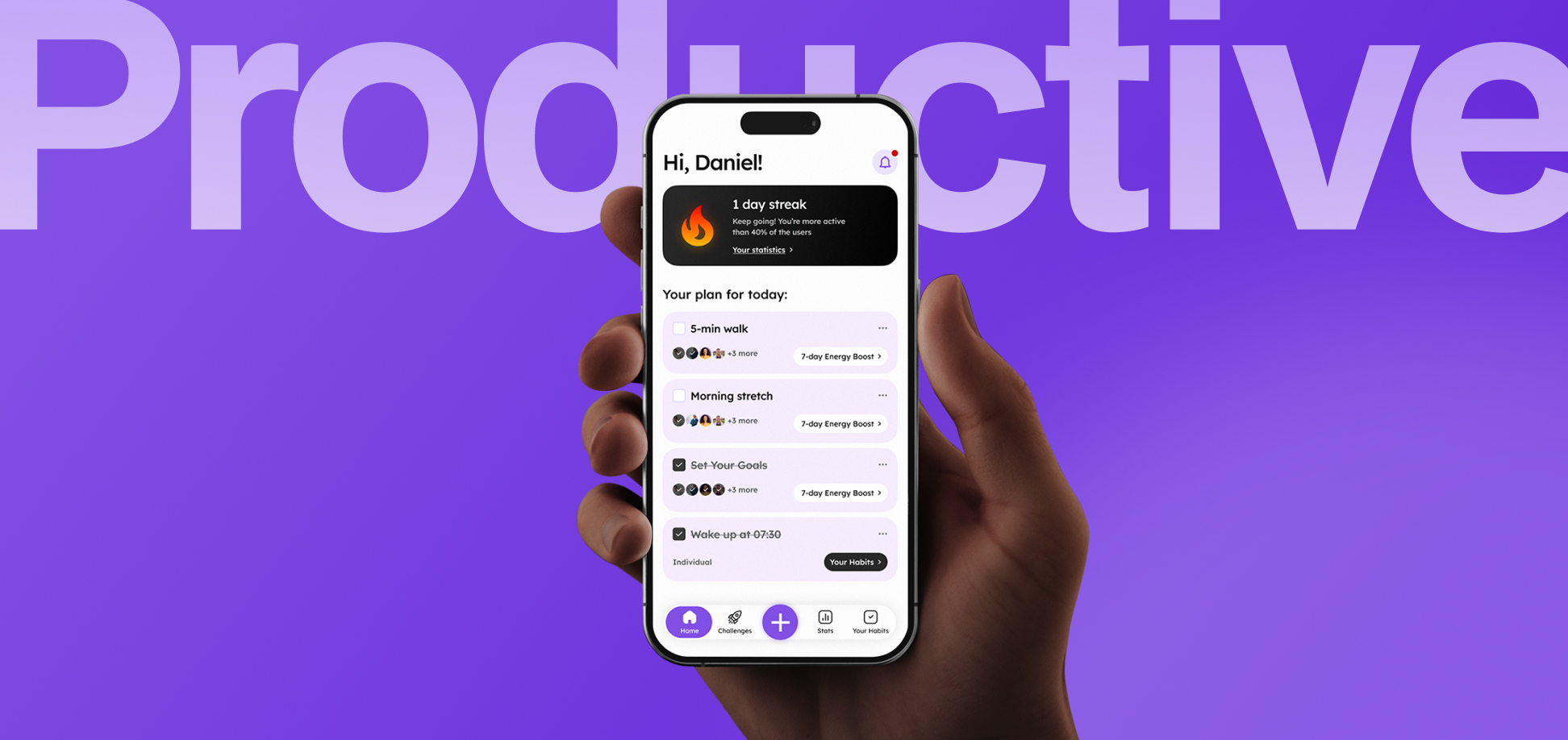
This case was created as part of the First Design challenge held at the Bending Spoons HQ in Milan.
I redesigned Productive, a habit-tracking app with 12,000 monthly active users and 300,000 annual downloads, recently acquired by Bending Spoons.
Goal
The redesign aimed to increase the app’s subscription conversion and revenue potential through two main objectives: → Increase the likelihood of users reaching a 7-day streak after onboarding; → Introduce a value-driven monetization approach that converts users after they experience the app’s value.
Solution
"Challenges" became the core of the product experience. I removed unnecessary sections and simplified the user flow to make the app more focused and transparent.
I also introduced gamification mechanics and a freemium model, positioning the premium subscription at the moment of highest user engagement — after users had already experienced the value of the product.
Design process
Briefing
Research Insights
At the beginning of the challenge, we were provided with key problems and insights identified through UX research.
Low retention
Among users who add a habit during onboarding, only 14% reach a 7-day streak in their first week. Users who reach a 7-day streak are 2× more likely to return within the next 14 days.
Strong features are hidden
Only 21% of users start a Challenge from the dedicated tab. However, users who join a Challenge show significantly higher commitment than the broader user population.
Commitment is social
Users who invite at least one friend to join a Challenge are 2.4× more likely to complete it and join a new one.
competitors analyis
Existing Solutions
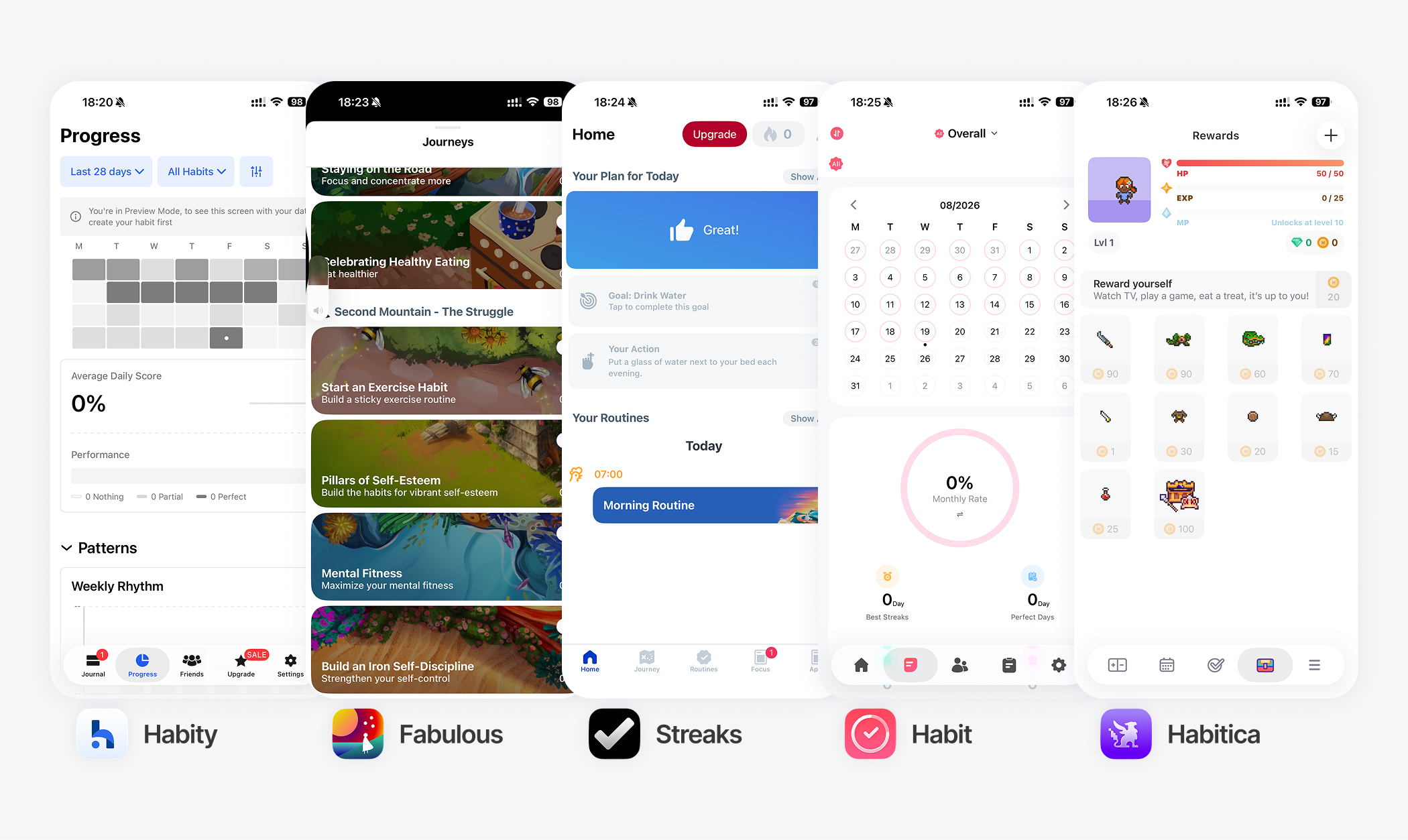
To identify established patterns and opportunities, I analyzed five of Productive’s main competitors.
Main Findings
→ Successful products focus on social and time-bound challenges, rather than individual habits alone.
→ Streaks work when users are already invested in the outcome. At the same time, forgiving mechanics are important — the product should motivate users without creating unnecessary pressure.
→ Monetization works best after the value moment, not before it. The strongest habit-building apps introduce premium features after users have already experienced their first success.
App Architecture Changes
Strategy & First Ideas
With only 24 hours to redesign the product, I decided to work top-down — starting with strategic decisions and then translating them into user flows and UI changes. I defined three main strategic shifts:
From explanation to interaction
Onboarding определяет первое же касание с приложением — и в случае Productive
From habits to challenges
Из UX рисерчка прямо следует, что пользователи гораздо больше вовлекаются в челленджи. Таким образом, я
From functionality to
Users who invite at least one friend to join a Challenge are 2.4× more likely to complete it and join a new one.
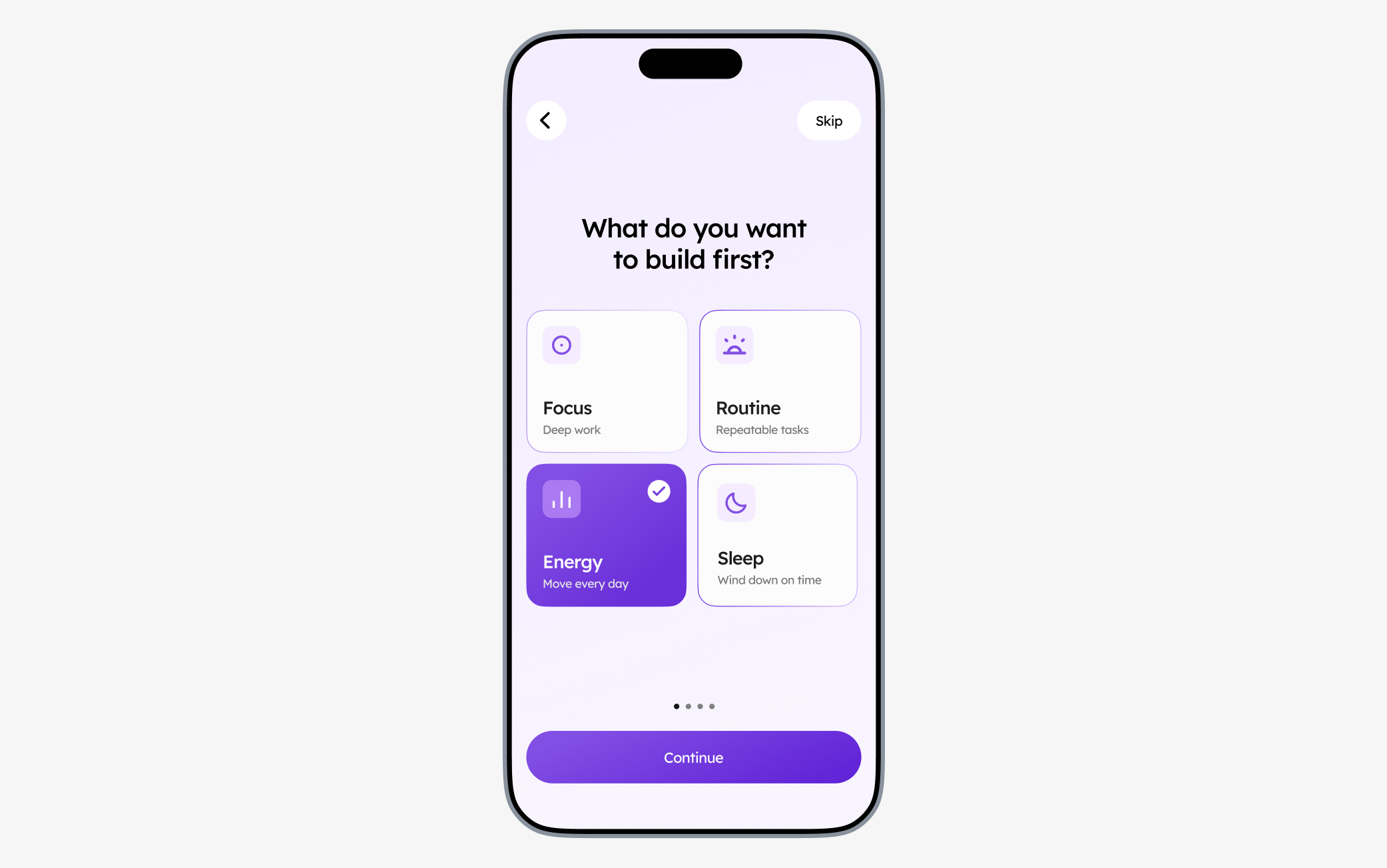
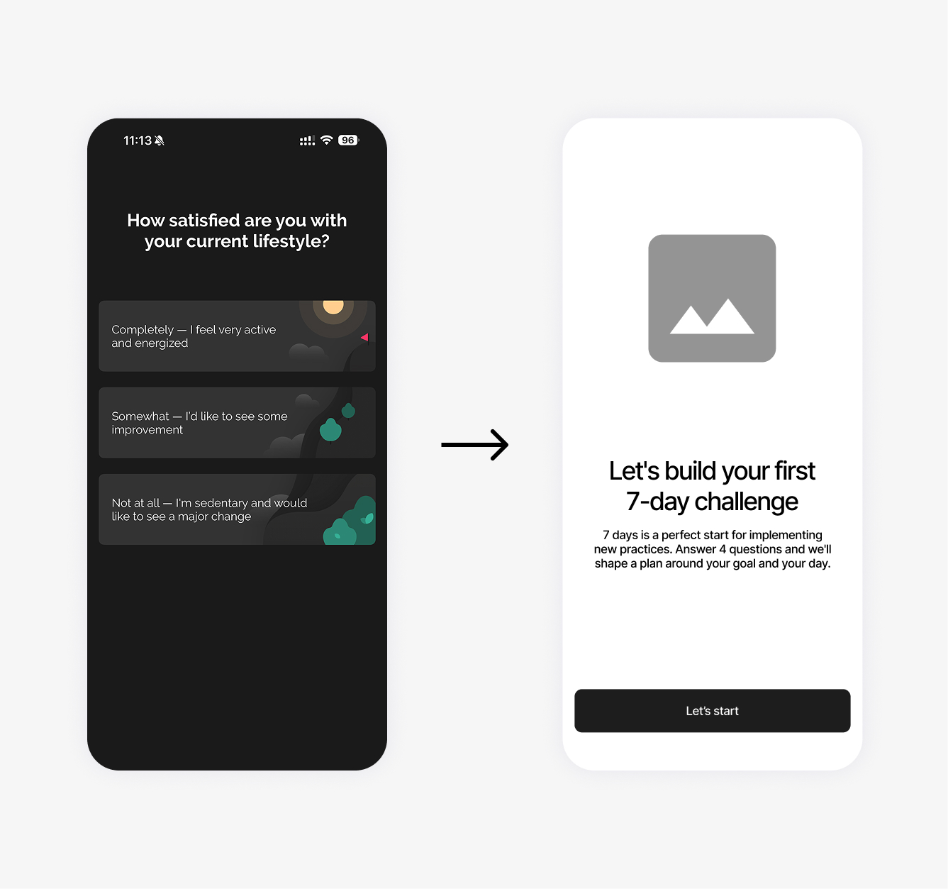
Onboarding became more interactive and action-oriented, helping users experience the product instead of reading through unnecessary information.
From habits to challenges
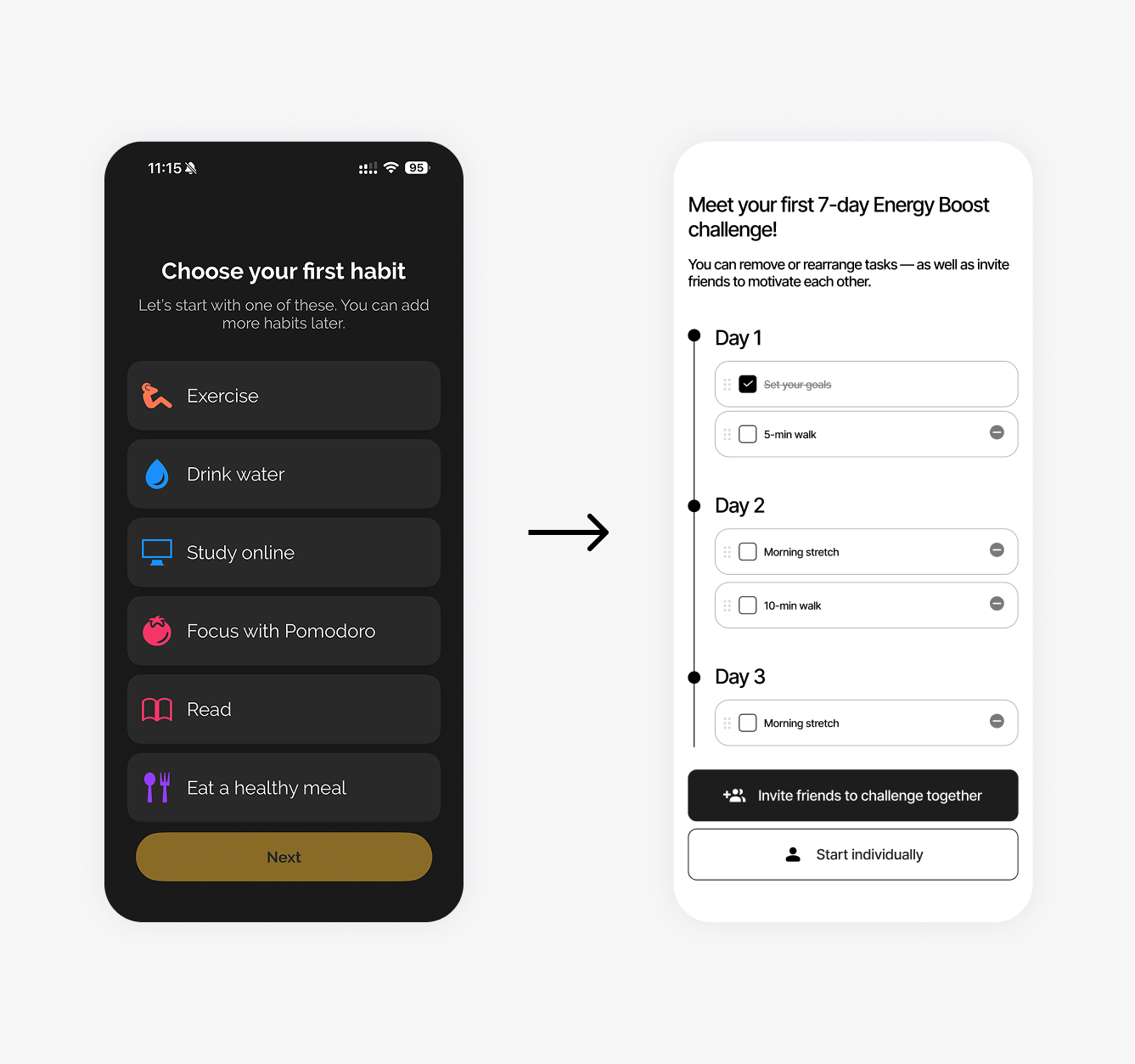
Challenges became the core of the product experience, reflecting users’ stronger engagement with them compared to individual habits.
From asking to offering
The monetization strategy shifted from upfront subscription requests to contextual premium offers introduced after users experience the product’s value.
User flow
First prototype
After defining the new strategy, I created the first version of the user flow. The main challenge was the relationship between Habits and Challenges: they felt like two separate products combined into a single app. Even the home screen communicated two different messages and required users to switch between two mental models.
Key Challenge
How can I connect Challenges and habits into one coherent mechanic and turn two separate concepts into a natural, intuitive user flow?
Turning Point
Connecting Challenges and Habits
After identifying the inconsistencies in the first prototype, I stepped back to the architecture level and redesigned the core mechanic.
Challenges at the centre
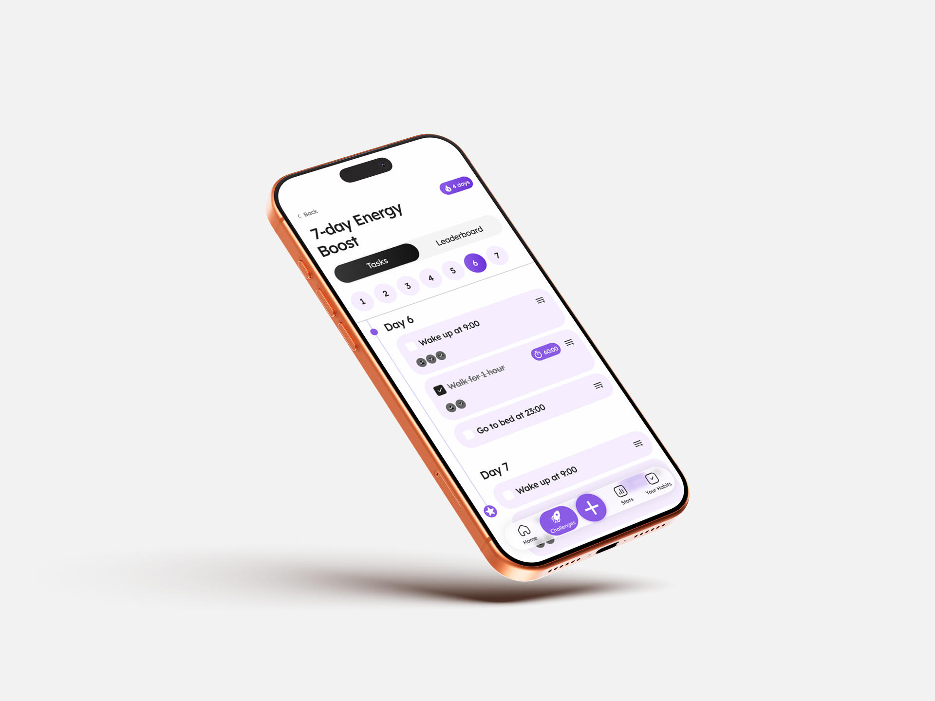
Challenges with different activities became the foundation of the user journey, giving users a clear goal and a reason to engage with the app.
From Challenges to habits
Users can save an activity they enjoy from a Challenge and turn it into a daily habit. This creates a natural transition from short-term engagement to long-term behavior.
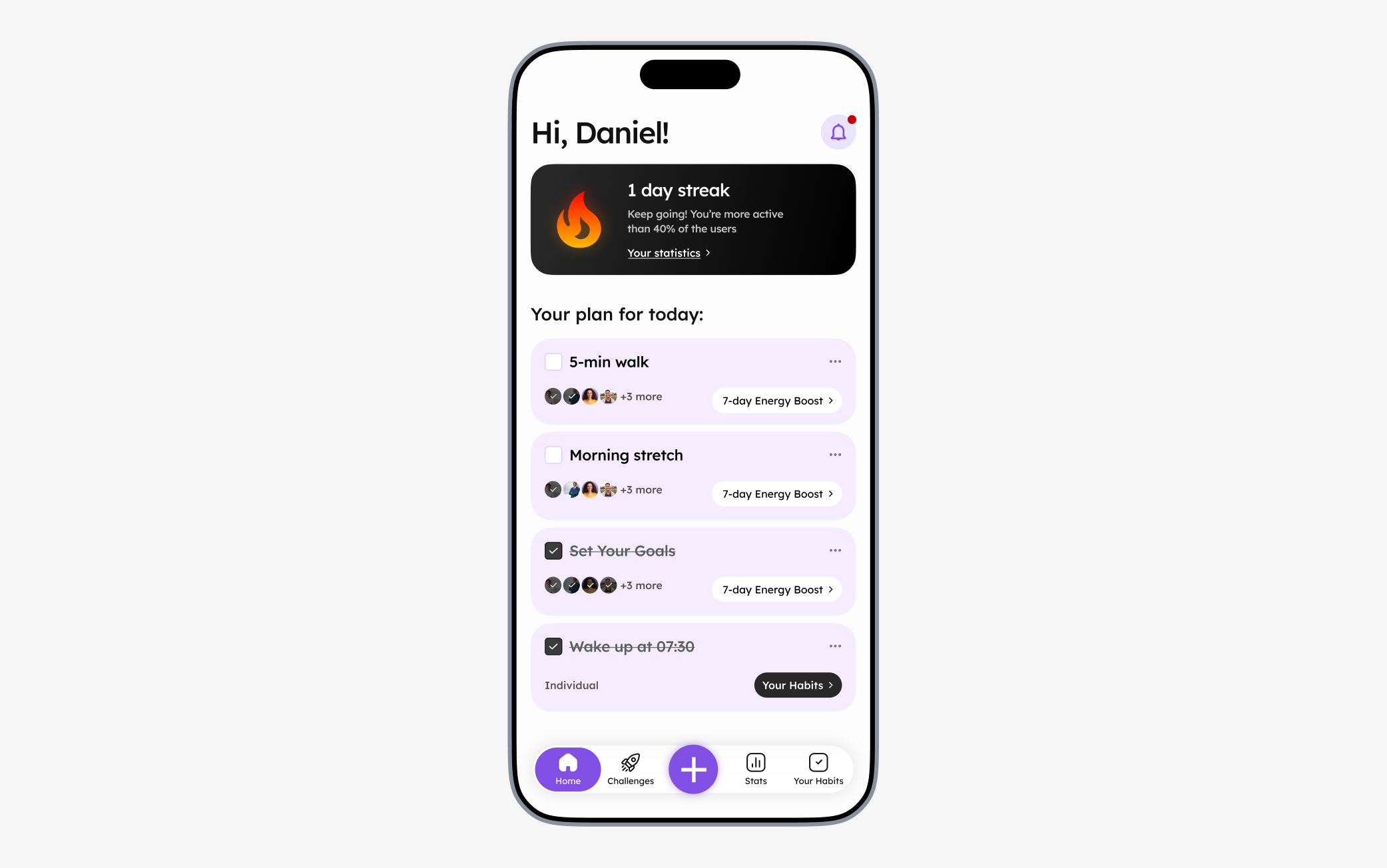
Daily agenda
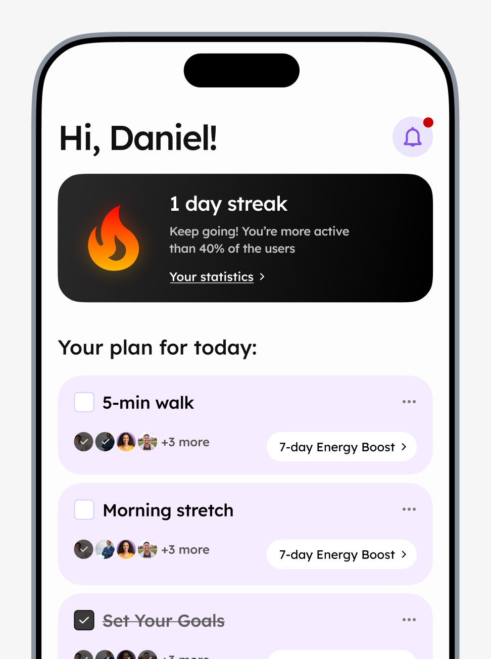
I replaced the two separate home experiences with a single Daily Agenda — a unified list of all activities and habits planned for today, with each activity linked to its Challenge (or to saved Habits).
This connected the two concepts into one simple mental model: Challenges are the core mechanic that drives social competition, while Habits represent the actions users have chosen to incorporate into their daily lives.
Going social
Clarifying Challenges and Streak Mechanics
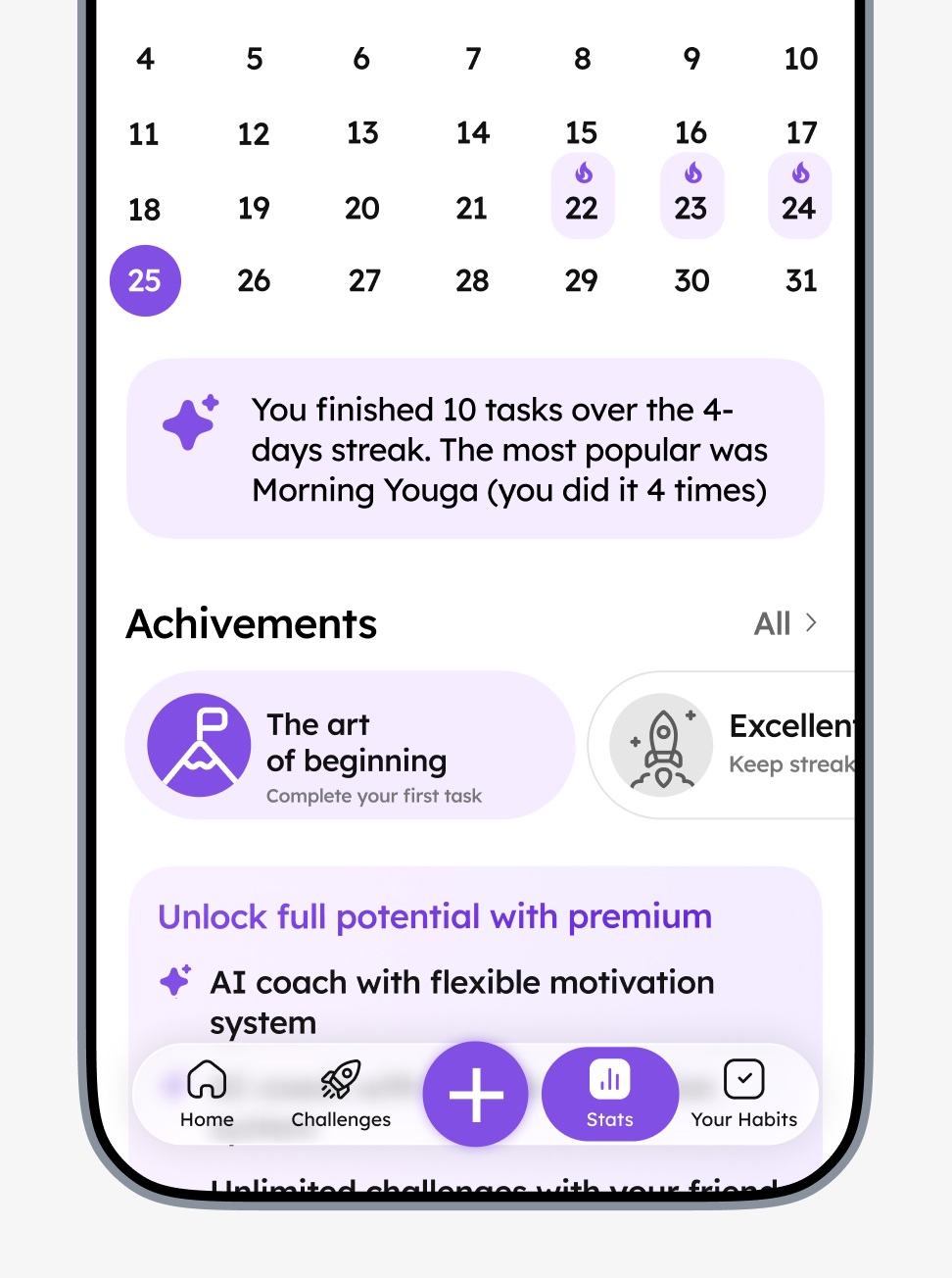
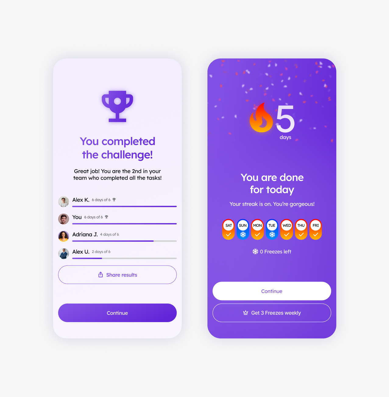
The next step was to develop the reward and engagement mechanics around social progress, streaks, and streak freezes. Competitor analysis and research showed that well-designed gamification mechanics can significantly increase engagement.
Users can see their friends’ progress within a Challenge, creating friendly competition without pressure. Streak milestones are reinforced with clear, rewarding notifications.
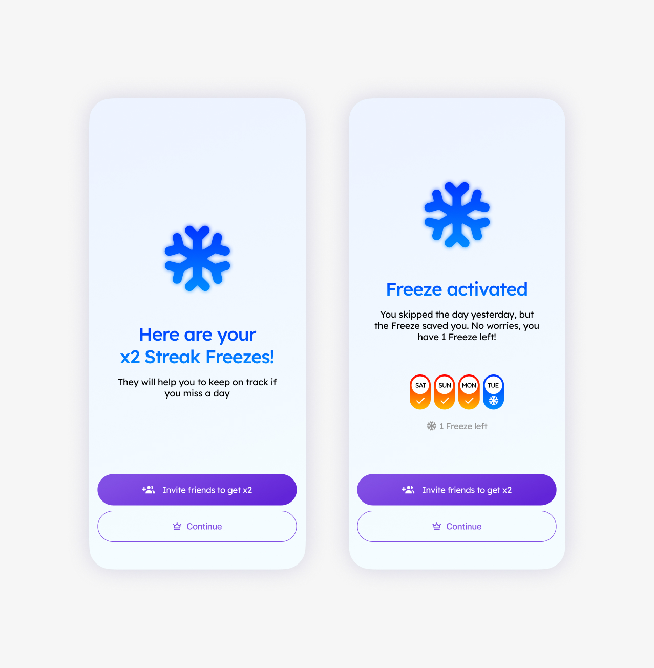
Mistakes are not critical
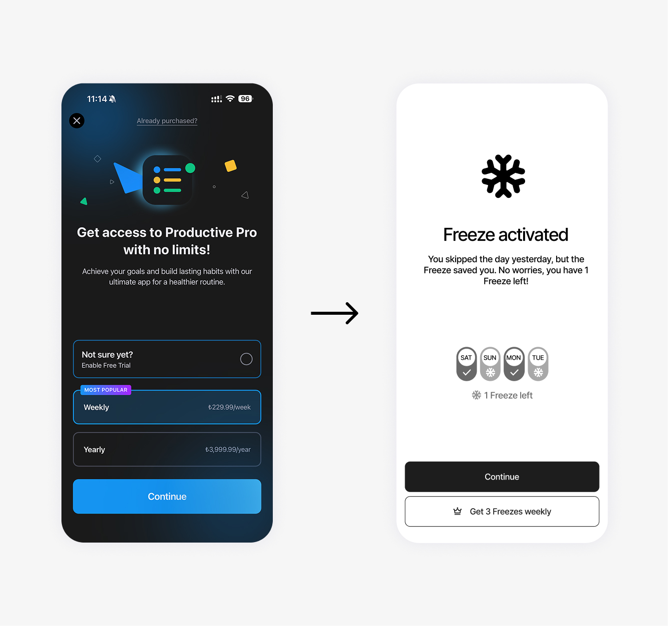
Streak Freezes let users miss a few days without losing their progress, making the system more forgiving.
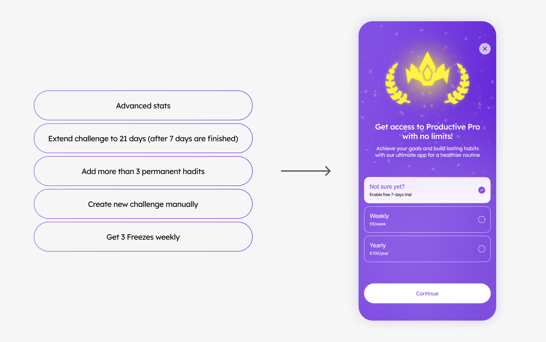
Premium adds flexibility
Premium features enhance the core experience and give users more flexibility without locking essential functionality behind a paywall.
business impact
Monetization Through User Value
To introduce a value-driven monetization model, I designed a flexible paywall system with different offers triggered at key moments in the user journey.
Instead of asking users to subscribe upfront, the app introduces premium offers when users are most engaged — after achieving a milestone, completing a Challenge, or reaching a moment when a premium feature becomes relevant.
This turns monetization from an interruption into a contextual product experience.
Interface design
A Completely New Visual Approach
I redesigned the visual language of the app from the ground up. The outdated dark interface was replaced with a lighter, cleaner, and more functional visual system. The new design uses clearer hierarchy, more approachable UI patterns, and a more polished visual language to make the product feel more modern and accessible to a broader audience.
User journey
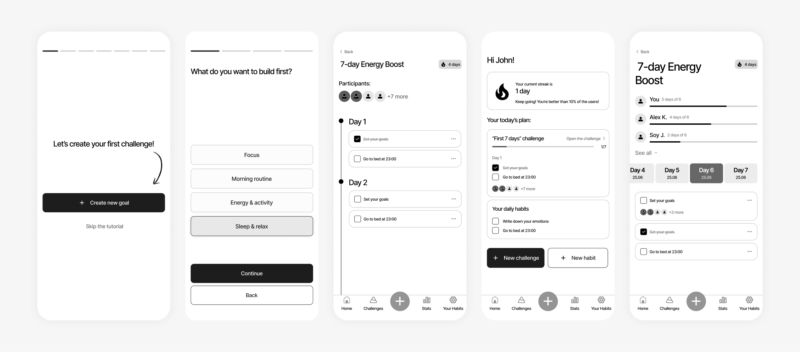
Final App Wireframe
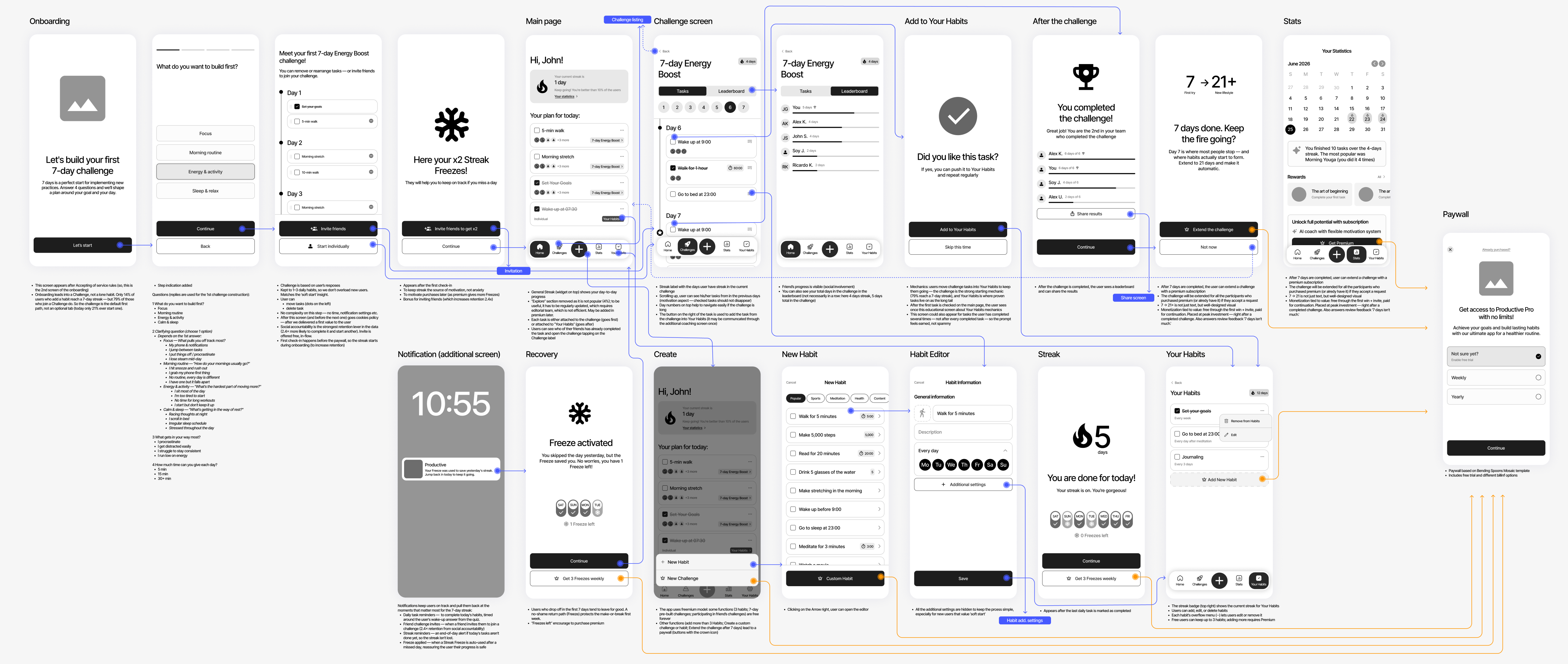
With the core mechanics defined, I mapped the complete user journey and translated the new architecture into a final app wireframe.
The flow connects onboarding, Challenges, daily activities, social progress, streak mechanics, and monetization into a single continuous experience.
.jpg)
.jpg)